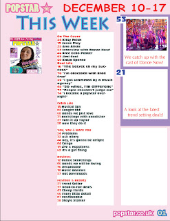
This is my finished magazine contents page, I have chosen bright colours so that they help help the magazine attract audiences.
Wednesday, 23 March 2011
Thursday, 17 March 2011
Session 3 of Music Magazine Contents Page
This is my is the 3rd time in process of the making of the contents page, and I think that it is getting on quite good, as I have been getting used to uing the computer software, I am making better progress, as I know fully how the software is to be used to its fullest potential.
Finished Music Magazine Article
This is my finished music magazine article. I think that it is good I decided not to remove the background of the image because I thought that it would be quite empty on the page. But if I was to improve the image I would of taken the photo in a better setting.
Wednesday, 9 March 2011
Finnished Front Cover
This is my finished front cover, I think that it is pretty good, I decided to use a white background so that the images and the sell and strap lines stand out better. I have used so many different colours on the front page because then the page would attract people towards the magazine. I have used two different subsidiary images which are of two different bands and dance groups. My masthead stands out on the page as it is bright yellow and large in font. I have included all neccessary information on the page such as includeing a barcode, date of publishing and website. I decided to remove the backgound on the main image so that it wouldn't distract peoples eyes from the sell lines and strap lines around the page.
Thursday, 3 March 2011
Images which I will be using for my magazine
This is the image which I will be using for my magazine contents page. I will remove some of the background but leave it around the body so that it shows that she is actually sitting on stairs.
This is the image which I will be using for my magazine front cover. I will remove the background. I have decided to take medium close up of the face and the shoulders so that it willl fit on my cover better.
This is the image which I will be using for my magazine article and I will also remove the background of the picture and this image will be placed on the right hand side of the page.
I will use this image on my contents page, it is similar to the image I have on my front cover, but different as in the poses and props. I have decided to use different images from my front cover so that it makes the page a bit more interesting to look at.
Subscribe to:
Comments (Atom)


