This is going to include information about the research and planning of my music magazine, along with an evaluation of the magazine front cover, contents page and the double page spread.
The Front Cover

My front cover generally conforms to the conventions of a real music magazine as the layout provides a centre stage for the feature article.
the subsidiary images and features tie in with articles an audience would expect to find in a real music magazine. I chose to include 2 extra subsidiary images onto he front cover after I observed other music magazine front covers and they seem to have about the same amount of subsidiary images.
The font for the masthead is a rather modern and bold font, it really stands out to its audience on the page.
Here are some examples of music magazine front covers which have a minimum of one subsidiary image on them;
The colour scheme on the music magazine front cover is bright and I think it will attract an audience towards the magazine, I also decided to use a bright colour scheme because I think it suits the target audience category which I chose, as it is a mostly female based target audience for the ages of 13 - 19 years of age.
The main image on my front cover The main image for my front cover appeals to the target audience as the female is young and stylish. I chose to use a plus size model for my main image because I thought that it would challenge the typical models who are on other magazine front covers. I thought that for the target audience it would be an excellent role model.

 I manipulated the main image using Paint Shop Pro, I removed the background as I didn't want the background to take any of the focus to have been taken from the main image and the other parts of the cover.
 For the two subsidiary images I didn't remove the background, but for the poster image I used Paint to attach four images of the same band, but in different poses. The band is based on an actual band, but I decided to change the name as it would make it unique. I decided to use Yellow split screen to separate the four images, and make it look more modern and funky looking.
 For the second subsidiary image I decided to leave the background and actually didn't edit the image at all, as I thought it would appeal to audiences. The subsidiary images would attract different audiences towards the magazine, as there is a mix of males and females on the images. The colour schemes in the subsidiary images are both striking.
The Contents Page
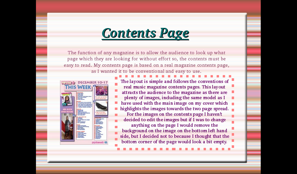
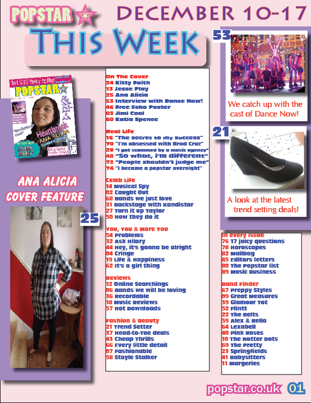
The function of any magazine is to allow the audience to look up what page which they are looking for without effort so, the contents must be easy to read. My contents page is based on a real magazine contents page, as I wanted it to be conventional and easy to use.
The layout is simple and follows the conventions of real music magazine contents pages. This layout attracts the audience to the magazine as there are plenty of images, including the same model as I have used with the main image on my cover which highlights the images towards the two page spread.
For the images on the contents page I haven't decided to edit the images but if I was to change anything on the page I would remove the background on the image on the bottom left hand side, but I decided not to because I thought that the bottom corner of the page would look a bit empty.
The Double Page Spread
The background design which I chose to use was a simple pale pink colour with a zigzag border, I chose to do this so that it gives the page a modern look to it.
The contents of my magazine article would appeal to the target audience, as the question and answer format is easy to follow, and the introduction gives an overview about the artist just in case the audience are unsure of her. I chose to use the pull quote “She rocketed to fame when her debut single Runaway hit no.1 in the UK charts”, because younger readers are mostly up to date with the music in the charts and who and what songs they like and as it was in the charts, they might want to introduced to other music choices of the same genre.
I only used one image on the double page spread because I decided to use fill up the page with more writing about the artist, as it avoids clutter and keeps with the conventional article layout.
I decided not to remove the background on the image as I thought the page would have looked a bit bare, but if I was to improve on the image on whole I would have taken the picture in a better scene or even chose to remove the background.
Representation Of Social Groups
In each of my images I have used both young and male and female models which would attract the target audience I am trying to attract as the magazine is clearly a modern and trendy magazine, by using both male and female models the magazine will appeal to both genders but mostly females, I have tried to influence this on the colour scheme throughout the magazine.
The Magazine Industry
 l The distributor of a magazine is responsible for maximising magazine sales in the most cost – effective way. They have to understand the audience in order to develop effective strategies for driving category sales.
l Frontline was formed in june 1986 by the magazine publisher Emap (now Bauer Media) in order to handle the demands of their ever expanding circulation department.
l Frontline sells and distributes over 160 magazines from partnering companies, including 54 of the top 200 magazines selling in the UK.
Frontline Supply Chain
Publisher → Distributor → Wholesaler → Retailer → Consumer
l For my magazine I have had the idea of the POPSTAR* brand and my magazine would be one platform in its repertoire. An established brand can create a sense of position, belonging and confidence when choosing a magazine. By becoming a brand, POPSTAR* would secure a trusted and loyal audience.
Technological Aspects Of The Production
l When producing my magazine, I used a variety of different technologies. When constructing my magazine, I used ADOBE IN – DESIGN which is a desktop publishing software which is used to organise layouts.
l To manipulate my images such as resizing images and removing backgrounds, I removed the backgrounds to the images I used a clipping path, and feathering an image in PAINTSHOP PRO.
l Also I did the research needed using the internet and the THIRD EDITION OF OCR MEDIA STUDIES FOR AS.
l I used a CAMERA to capture my images, I needed to think a lot about who would be in my images and where would be the setting used, I also had to think about what angle would be used to shoot the images. The setting in particular was very important because of the light needed whether it was to be natural or artificial lighting and whether the image is to be taken indoors or outdoors.
The Preliminary Task
The preliminary task of the production was to create a school magazine front cover. This has allowed me to familiarise myself with the technological aspects of the production needed in the task.
l There is a clear improvement especially with the colour scheme as in my preliminary task there was only two colours introduced, but with my music magazine it is bright and modern looking.
l The double page spread and contents page have allowed me to create a fuller product, and therefore generate an identity and a recognised colour scheme throughout which is bright and modern.
l I have researched the music and magazine industry in great detail to comply with the conventions and the ability to understand the ability to understand the ability to target an audience.
l I am pleased with the overall layout and design because although I have followed the typical layout and conventions of a music magazine, I have inserted my own preferences towards the layout of the magazine.